Oreo is one of my favorite cookie brands since I was a child but I have never visited their website before. After I decided to write the UX of Oreo, I was quite curious what would their website be like. Maybe the theme would be black—since the key word of Oreo is chocolate—with some cartoons or young children. When I visited their website, I found out I was wrong.
The main colors of Oreo’s website are blue and white and the design is quite simple. I wondered why they choose blue instead of black until I finally noticed their logo. The colors of Oreo’s logo are blue and white. So the design of the website matches the logo very well, which I think is very clever.
Oreo’s website give me a good user’s experience.
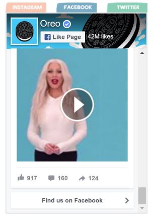
First, the website is very easy and pleasure to use. The design is simple and I can see all the messages clearly. The menu is on the top and the icons linked to the social media accounts are just next to the menu. And when I am in different sub-pages, it is very easy for me to go back to the home page—just click their logo on the top. The color matches the logo very much and doesn’t make my eyes feel uncomfortable. And on home page, I can have a glance at their social media contents without going to their pages, which I think is very unique and convenience.
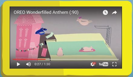
Second, the website has a fascinating content. It tells the story of wonder. What will happen if we give Oreo to different people, different animals or even different imaginary characters? Oreo can give us a wonderful world full of imagination and beauty. They use very unique cartoon characters to make them more fascinating. For example, they tell us a brand new story of the wolf and three little pigs. After the wolf eats Oreo, he becomes a good friend of three pigs and live a happy life together with the pigs. They also tell us we can play with Oreo everyday differently if we can imagine.
The image they use to show ” Open up to wonder” is very interesting too. We can see two people open an a biscuit and what inside is white. On one hand, it is cream so it is white. But on the other hand, white means blank. We can imagine whatever we want. Different people will have different answers so what we open is a wonderful world.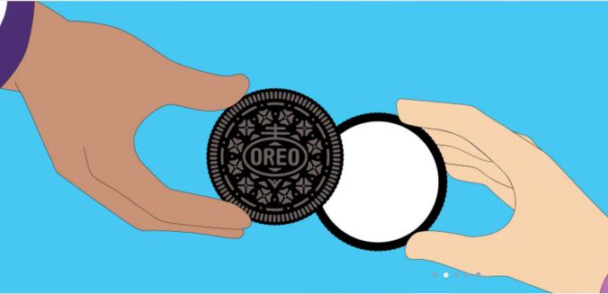
Oreo tells a good story of “wonder”. The other main task of the website is to introduce all of their products. They also do a good job. They have sub-pages and pictures to introduce their different product series, which are clear and organized. Although we can’t buy cookies from the website, it has the function to search where is the nearest place for us to buy the cookies we want, which is very user centered.
Oreo also has the website for mobile device, which shares the same information with the website for laptop or desktop but fits very well on my mobile phone. It also uses blue and white as the main colors. The mobile website has clear menu and go back to home page function, it also has the link to the social media accounts, and even has the link to APP store to download the Oreo game, which is specially designed for the mobile. The mobile website is very easy to use. I think I like the website for mobile more than the website for laptop. But that is just because I use my mobile phone more often. They are both very fascinating websites for me. It seems like Oreo doesn’t have special website for tablet now.
Oreo gives me wonderful user’s experience. It is true a wonderfilled brand.
(Oreo’s website: http://www.oreo.com/ )
